Homepage sliders are one of those features that every e-commerce site seems to need, yet finding a decent solution for PrestaShop that doesn’t tank your PageSpeed score is surprisingly difficult. After wrestling with Revolution Slider and watching my Lighthouse performance drop from the 90s into the 60s, I decided to build my own.
Here’s how it came together and what it does.
The Problem with Existing Solutions
Most slider modules for PrestaShop fall into two camps: either they’re bloated page builders masquerading as sliders, or they’re so basic they lack essential features like mobile-specific images.
Revolution Slider is powerful, but it loads hundreds of kilobytes of JavaScript regardless of whether you’re using any of its advanced features. For a simple rotating banner, that’s overkill.
What I actually needed was straightforward:
- Separate desktop and mobile images — Different aspect ratios for different devices
- Responsive image delivery — Using srcset so browsers download appropriately sized files
- Automatic WebP conversion — Modern format, smaller files
- Zero additional JavaScript — Leverage what’s already in the theme
- Clean admin interface — Something clients can actually use
Leveraging What’s Already There
Here’s the thing about PrestaShop themes—most modern ones already include Swiper.js for product carousels, category sliders, and various other components. The starter theme bundles it, and premium themes like Flavor and Flavor Light include it too. Loading another slider library on top is wasteful.
So the first decision was simple: build on Swiper.js and add zero JavaScript overhead. The module checks if Swiper exists (it always does) and initialises itself. Total additional JS: roughly 40 lines of configuration code.
Solving the Mobile Image Problem
One of my biggest frustrations with existing sliders is handling mobile. A 1920×400 desktop banner looks rubbish on a phone—you either end up with a tiny letterboxed image or awkward cropping.
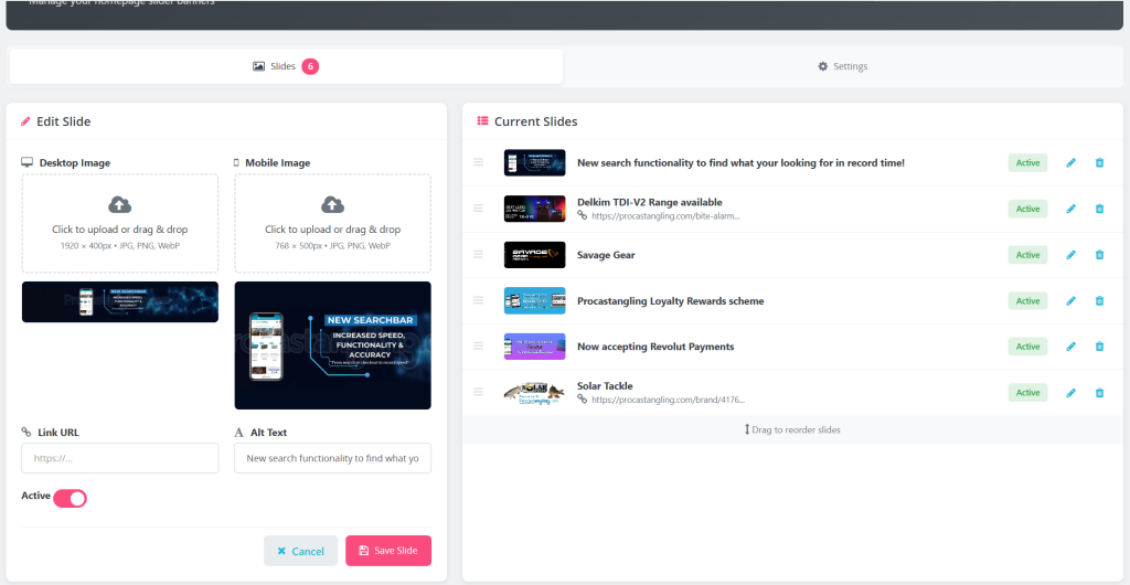
The proper solution is separate images with different aspect ratios: wider for desktop, taller for mobile. The module enforces specific dimensions:
- Desktop — 1920 × 400 pixels
- Mobile — 768 × 500 pixels
Using the <picture> element with media queries, the browser automatically selects the appropriate image. No JavaScript viewport detection, no layout shift—it just works.
Responsive Images for Better PageSpeed
Even with separate mobile images, serving a 768px wide image to a 412px viewport (common on most phones) wastes bandwidth. Modern browsers support srcset, which lets us provide multiple sizes and let the browser choose.
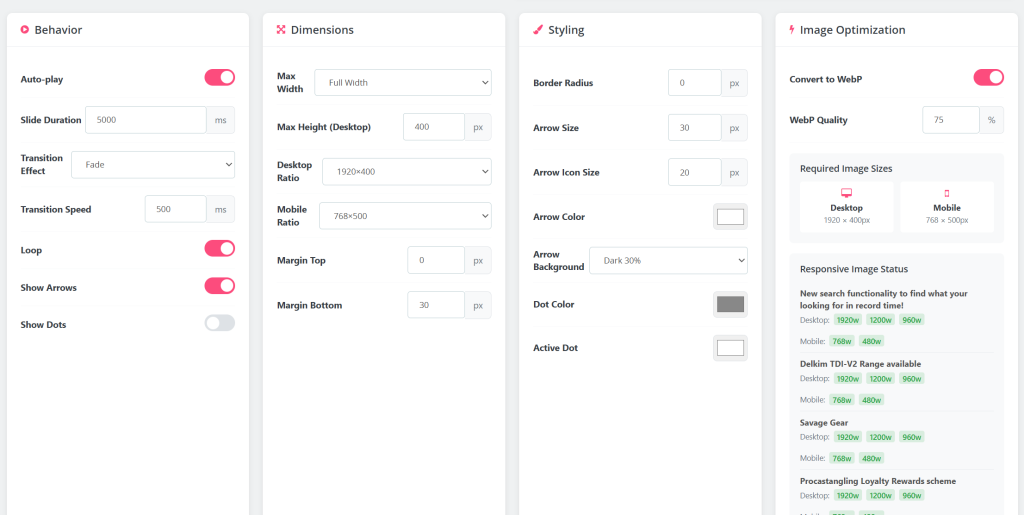
On upload, the module automatically generates responsive variants:
- Desktop — 1920w (original), 1200w, 960w
- Mobile — 768w (original), 480w
A phone with a 412px viewport now downloads the 480w image instead of 768w—roughly 40% smaller. On high-DPI displays, the browser intelligently selects the larger size to maintain sharpness.
Automatic WebP Conversion
PrestaShop 8.x has native WebP support for product images, but most slider modules ignore this. Clients upload JPEGs or PNGs, and that’s what gets served.
The module hooks into the upload process and converts images to WebP automatically using GD library. Quality is configurable (defaulting to 75%), and the conversion preserves PNG transparency. The original file isn’t kept—only the optimised WebP.
Combined with responsive sizing, this typically reduces banner image payload by 60-70% compared to serving full-size JPEGs.
A Modern Admin Interface
PrestaShop’s default module configuration UI is functional but dated. For something clients interact with regularly, I wanted something cleaner.
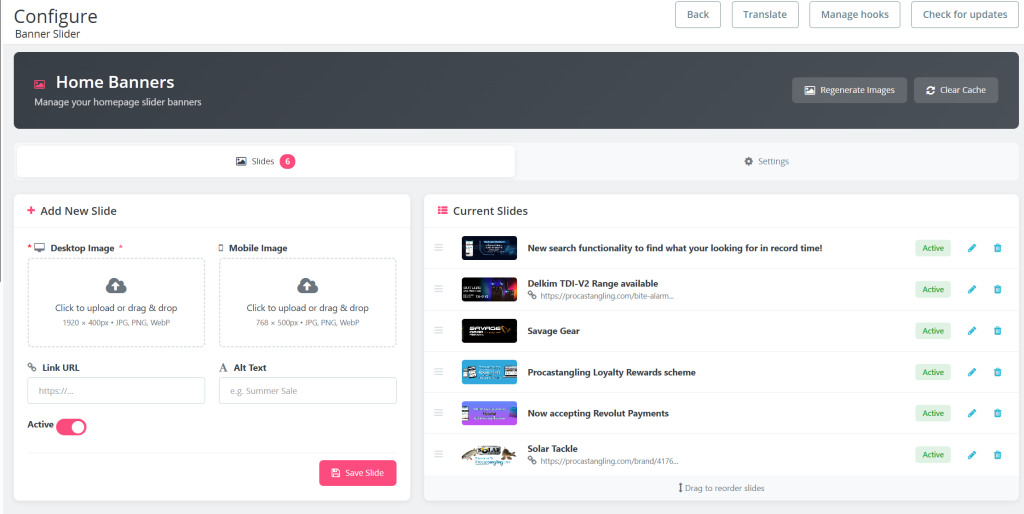
The admin interface uses a tabbed layout:
- Slides tab — Add/edit slides, drag-to-reorder, quick status toggle
- Settings tab — Behaviour, dimensions, styling options (rarely needed after initial setup)
Upload zones support drag-and-drop, dimension validation happens on upload with clear error messages, and there’s a one-click “Regenerate Images” button to create responsive variants for existing slides.
I also added a “Clear Cache” button that purges Smarty and Symfony caches—saves switching to another screen when testing changes.
Configuration Options
While keeping the module lightweight, I included the settings most clients ask for:
- Auto-play — With configurable duration
- Transition effects — Fade or slide
- Navigation controls — Show/hide arrows and pagination dots
- Arrow styling — Size and colour customisation
- Dimension constraints — Max width and height (useful for 4K displays)
- Visual options — Border radius, top and bottom margins
Everything outputs as scoped CSS targeting the specific slider instance—no global style pollution.
Integration with Page Builders
The module implements PrestaShop’s WidgetInterface, which means it works with page builders like Axon Creator out of the box. Drop a “Module” widget onto any page, select the slider, done. No shortcodes to remember, no manual hook positioning.
For developers who prefer hooks, the usual suspects are available: displayHome, displayTop, displayBanner, and so on. They’re not auto-registered on install though—I got tired of sliders appearing in unexpected places on fresh installations.
The Results
On a site where I replaced Revolution Slider with this module:
- Lighthouse Performance — 64 → 92
- JavaScript reduction — ~180KB removed
- Image payload (mobile) — ~200KB → ~60KB
- LCP improvement — ~1.2 seconds faster
Your mileage will vary depending on image content and existing optimisations, but for most sites swapping out a heavy slider for something purpose-built makes a noticeable difference.
Lessons Learnt Along the Way
A few things I picked up during development:
PrestaShop’s file upload handling is quirky. In the module configuration context, uploaded files get processed before your postProcess method runs. If you rely on $_FILES being available when handling form submissions, you’ll find the temp files have already been cleaned up. The solution is processing uploads in getContent() before any other logic runs.
Aspect ratio CSS needs careful handling. Setting aspect-ratio as an inline style overrides media queries due to specificity. Moving dynamic styles into a style block with the slider’s unique ID as a selector solved this.
4K monitors break assumptions. An aspect-ratio of 1920/400 scales to 800px tall on a 3840px wide display. Adding a max-height constraint keeps things sensible without breaking responsive behaviour on normal screens.
What This Means in Practice
Sometimes the best solution is the one you build yourself. This slider does exactly what I need—no more, no less. It’s fast, the code is understandable, and when clients ask for changes I can implement them without reverse-engineering someone else’s framework.
If you’re struggling with slider performance on PrestaShop, the approach is transferable even if you don’t use my specific implementation: leverage existing libraries, enforce sensible image dimensions, generate responsive variants, and convert to WebP. Your PageSpeed scores will thank you.
Need help optimising your PrestaShop store’s performance? Get in touch!